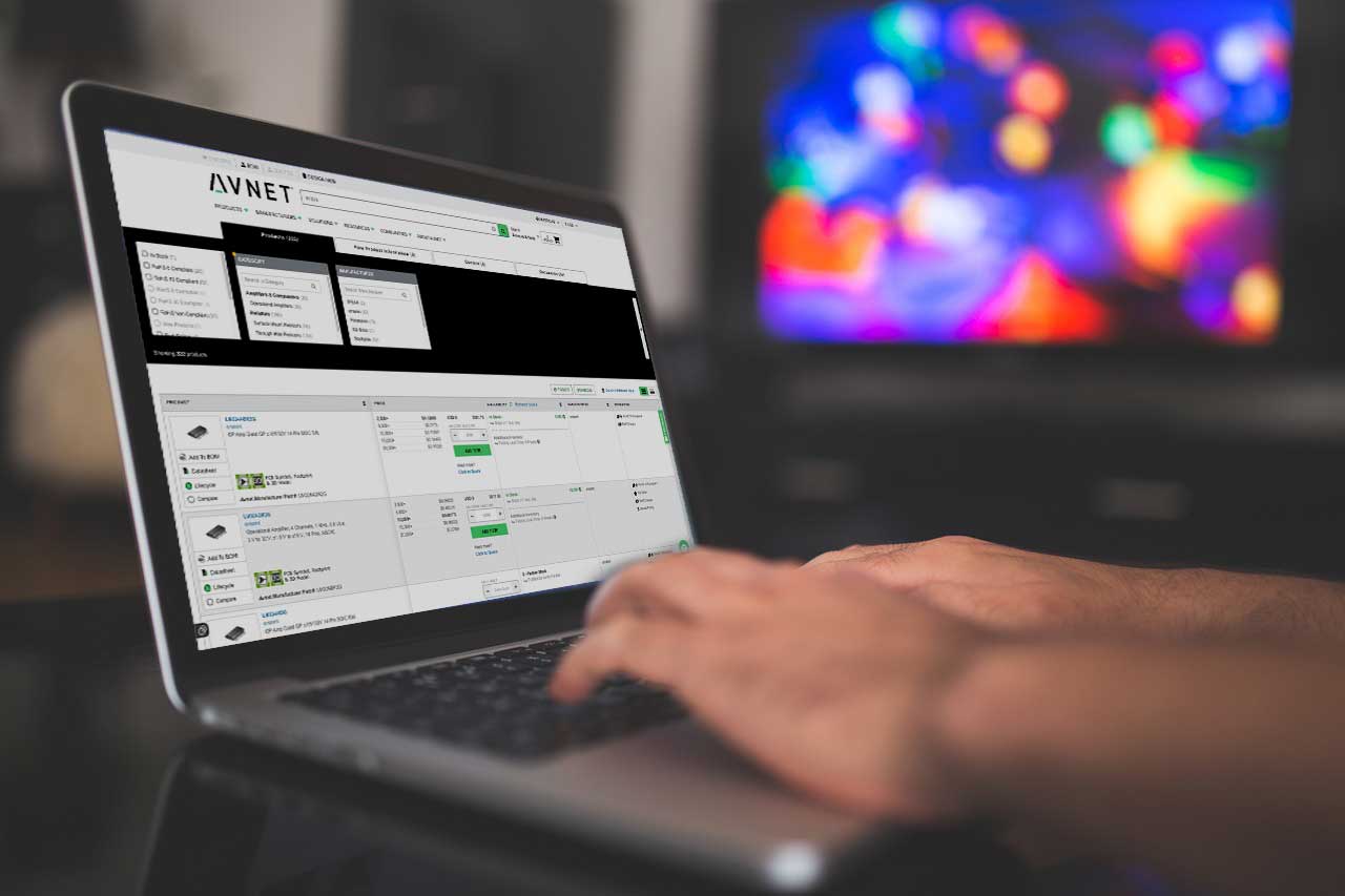
Product Listing Page
Avnet, Inc is a leading global distributor of electronic components and provides technology solutions at the center of the technology value chain.
Project Summary
Client: Avnet, Inc.
Industry: Electronic component distributor and technology solutions
Platform: B2B E-commerce Website
Duration: 8 weeks
Role: Lead UX/UI Designer
Tools Used: Figma, Photoshop
01 | Project Background
One of the most critical parts of the clients e-commerce experience is the Product Listing Page (PLP)—where engineers, buyers, and procurement specialists begin their product discovery journey.
The Website’s Goal
- Optimize usability
- Maintain high performance
- Efficiently browse, filter and compare thousands of technical components
- Apply best practices to insure a proper responsive site for mobile devices

02 | Discovery & Research
User Interviews & Stakeholder Alignment
I conducted interviews with:
- Procurement specialists from clients
- Field Engineers
- Internal sales and support teams
Interviews
Key insights:
- Users need quick filtering by specs (e.g., voltage, package type).
- Comparison and availability data is essential for decision-making.
- Enhance scannability of product cards (title, specs, availability).
- Optimize for performance and mobile-first design.
Research Method
Identify 3 successful competitors for a comparative UX metric.
Arrow Electronics
- UX Performance Scored as “Good” in product quality and customer service, outperforming Avnet in these area.
- Website Features Offers a user-friendly interface with efficient search and filtering options, facilitating a seamless product discovery experience.
Digi-Key Electronics
- UX Performance Rated higher than Avnet in product quality and customer service, indicating a more favorable user experience.
- Website Features Provides detailed product information, datasheets, and real-time inventory updates, enhancing the user’s purchasing decision process.
Mouser Electronics
- UX Performance Also rated higher than Avnet in product quality and customer service, suggesting a more effective user experience.
- Website Features Features an intuitive product listing page with comprehensive filtering options and clear product specifications, aiding in efficient product selection.
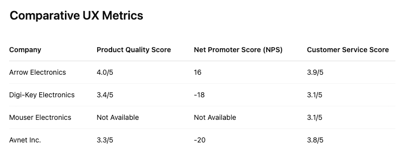
These metrics highlight areas where Avnet can improve to match or exceed the user experience standards set by its competitors.
Recommendations
To enhance the user experience of Avnet’s product listing page, consider the following strategies:
- Mobile Optimization: Address mobile usability issues to provide a consistent experience across devices.
- Enhanced Filtering and Sorting: Implement more intuitive filtering and sorting options to facilitate easier product discovery.
- Product Information Clarity: Insure that product details, including specifications and availability, are clearly presented to assist in decision-making.
- Customer Support Accessibility: Improve the visibility and accessibility of customer support options to enhance user satisfaction.
03 | Ideate
User Personas
Based on my research and interviews I created two User Personas to represent our audience’s motivations, frustrations, needs and goals.
Alex Smit
- Age: 35
- Job Title: Senior Embedded Systems Engineer
- Company: Mid-sized IoT Product Manufacturer
- Location: Austin, TX
- Experience Level: 10+ years in hardware and embedded design
- Goals:
- Quickly source components for prototyping and production
- Ensure components meet technical specs (voltage, package type, etc.)
- Compare availability and lead times across distributors
- Pain Points:
- Frustrated by poor filtering when searching specific components
- Hates when the inventory says “in stock” but is actually backordered
- Behaviors:
- Uses Avnet’s filters extensively (e.g., temperature range, footprint)
- Downloads datasheets immediately
- Often builds a BOM (bill of materials) and exports it to Excel or ERP
- Device: Desktop (dual-monitor setup)
- Needs consistent, detailed parametric data
- Quote: “If I can’t get to the specs in under 10 seconds, I’m out.”

Maria Delgado
- Age: 32
- Job Title: R&D Procurement Coordinator
- Company: Global Consumer Electronics Brand
- Location: San Jose, CA
- Experience Level: 15 years in tech supply chain management
- Goals:
- Ensure components selected by engineers are available and cost-effective
- Purchase samples for testing with minimal delay
- Track order history and pricing fluctuations
- Pain Points:
- Needs pricing tiers and availability without creating an account
- Often needs to coordinate orders across multiple internal departments
- Gets slowed down by long product pages with unclear CTAs
- Behaviors:
- Uses saved BOM lists and CSV uploads
- Frequently checks distributor pricing and stock levels
- Prefers to chat with sales for volume quotes
- Device: Laptop + phone (often on the go)
- Quote: “Speed and clarity. That’s what I need to hit my deadlines.”

Information Architecture
I restructured the PLP to prioritize:
- Filters left, products right: Consistent with user expectations.
- Sticky filter and sort controls for long scrolls.
- Clear labeling and grouping of technical specs.
Key Features:
- Faceted filters with expandable groups (e.g., Category > Voltage > Package)
- Breadcrumb navigation for context
- Dynamic counts showing number of results per filter option
04 | Design Process
Wireframing
I started with low-fidelity wireframes to get stakeholder alignment on content priority and page structure. I used my combined research findings and personas to guide my design.
- Grid vs. list layouts
- Interaction design for comparison, hover states, and filter behaviors
- Placement of CTAs (add to cart, datasheet, quote request)
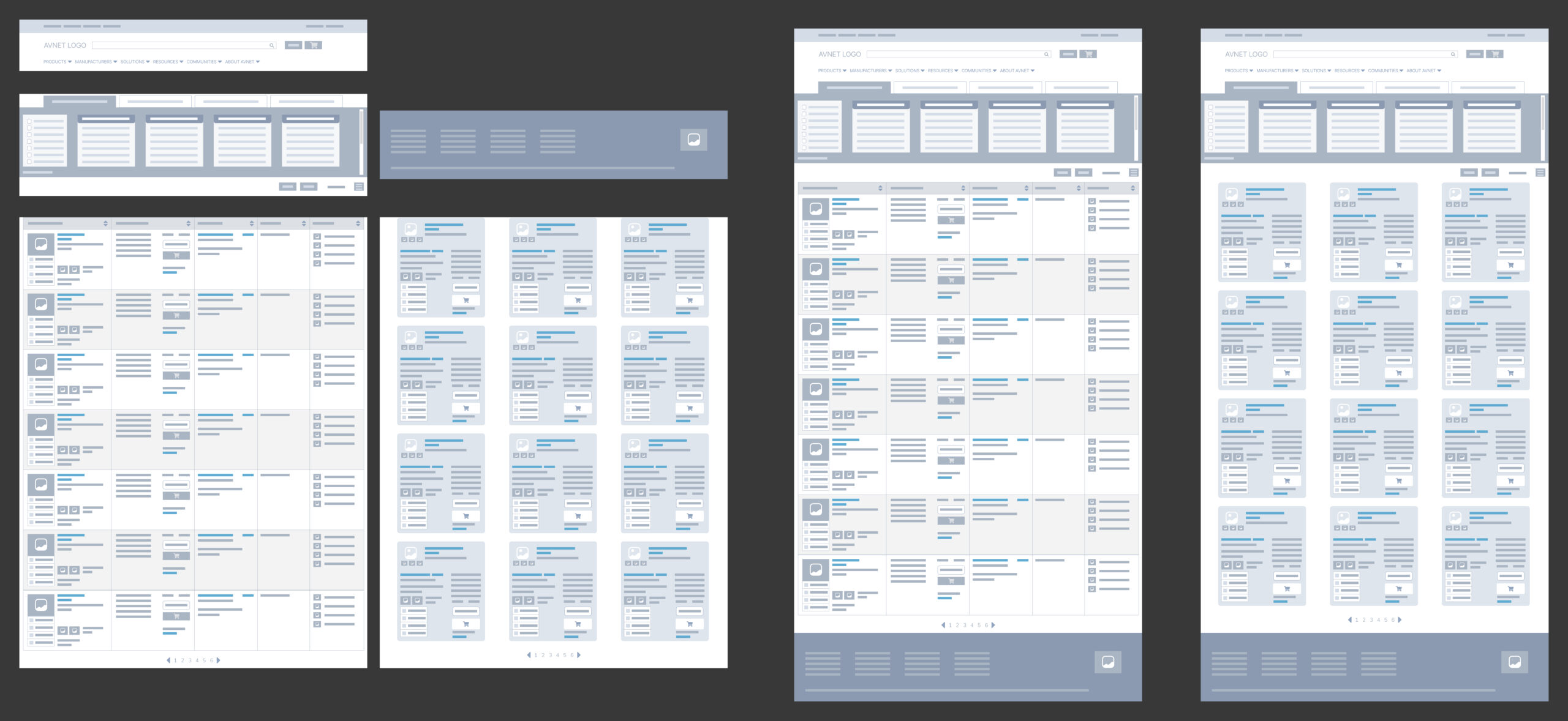
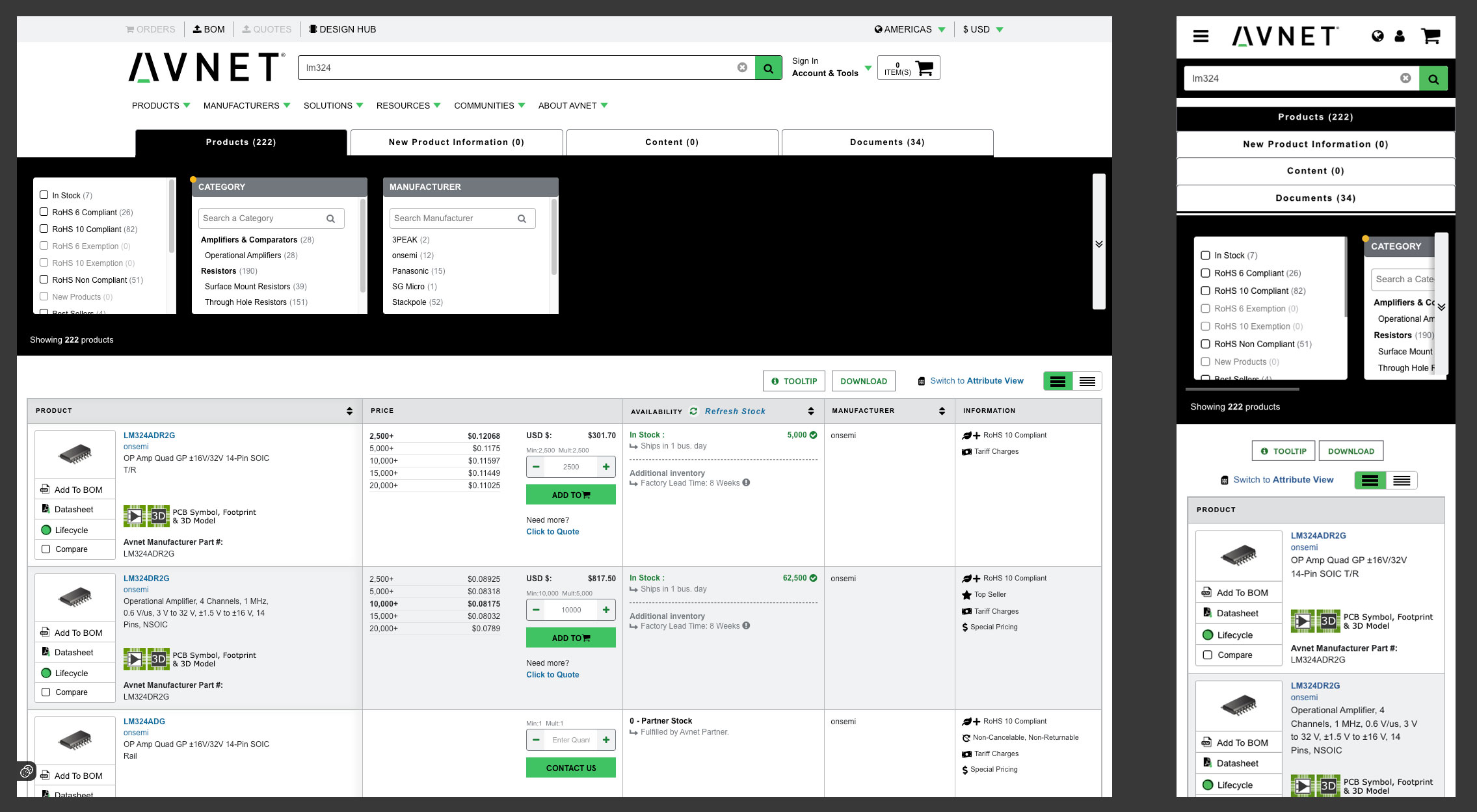
High Fidelity Design
I then moved to high-fidelity prototypes in Figma, including:
- List layout (best clarity of attribute comparisons)
- Real sample data to test layout stress and overflow behavior
- Responsive designs for desktop, tablet, and mobile
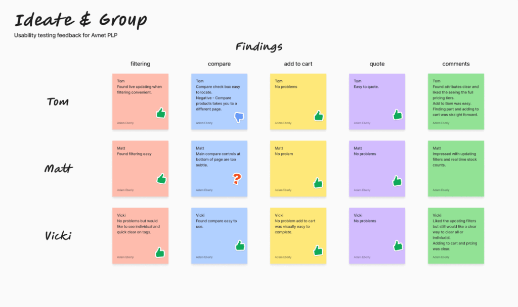
05 | Usability Testing
We ran remote usability testing sessions with 5 target users:
- Tasked with filtering for a specific component
- Asked to compare 3 products and add one to a cart
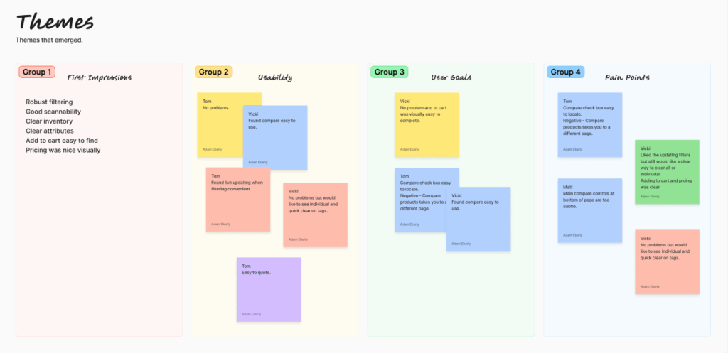
Findings:
- Users loved the live updating filters
- Inline datasheet access reduced frustration
- Some struggled with the “Add to Compare” control—too subtle
- Mobile users preferred the bottom sheet filter panel
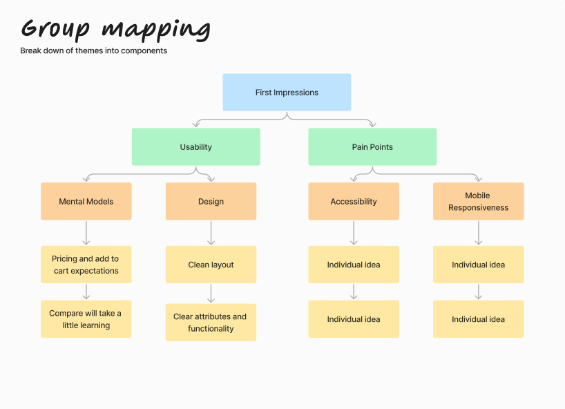
Iterations Based on Feedback:
- Made “Compare” persistent on scroll
- Improved filter tag UX (e.g., quick clear, individual removal)
- Added horizontal scroll to reduce need to click through
6 | Launch & Results
Post-launch metrics (30 days)
23%
Increase in product searches
17%
Reduction in time-to-first-click
15%
Drop in bounce rate on PLP
18%
Increase to cart conversion
Key Learnings
The redesign of Avnet’s Product Listing Page not only elevated usability and performance but also aligned with the technical expectations of its engineering-heavy user base. By embracing UX best practices—such as faceted filtering, responsive design, and robust product comparison—we created a scalable, efficient, and intuitive browsing experience.