OCM Technology

OCM Technology provides a goal driven change management and collaboration app to help companies consolidate change tools and improve how to monitor, measure and manage change implementation.
Project Summary
Client: OCM Technology
Industry: Enterprise SaaS / Organizational Change
Platform: Web-based marketing site with conversion funnels to SaaS app
Duration: 10 weeks
Role: Lead UX/UI Designer
Tools Used: Figma, Figjam, Photoshop
01 | Project Background
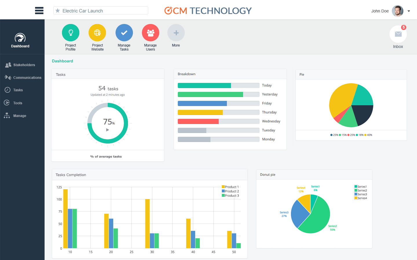
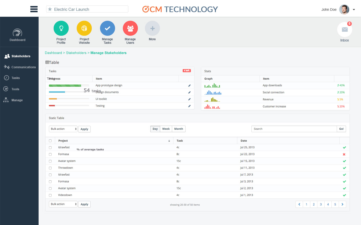
OCM Technology is a modern platform designed for organizations managing complex transformations—whether M&A, digital initiatives, or org redesigns. The platform consolidates tools used in change implementation (like change impact assessments, stakeholder plans, communication calendars) into one structured, goal-driven workspace.
The Website’s Goal
- Demonstrate the app’s unique value with real use cases and images
- Position OCM Technology as a premium, trusted enterprise solution
- Educate visitors on the pain of fragmented change management tools
- Drive sign-ups for free trials
02 | Discovery & Research
Kickoff & Requirements Gathering
Met with product owners and the CEO to align on success metrics:
- Increase qualified trial requests
- Increase retention time
- Communicate “why OCM Technology” in under 5 seconds
- Use storytelling to differentiate from clunky legacy tools
Stakeholder Interviews
I led a workshop with stakeholders to surface goals, pain points, and expectations. Key insights:
- Decision-makers were often HR leaders or C-suite executives
- Visitors usually came from referrals or Google searches
- Pages tailored to roles (e.g., for Change Leaders)
- Persistent messaging and CTA across site
- There was a need to educate clients before pitching services
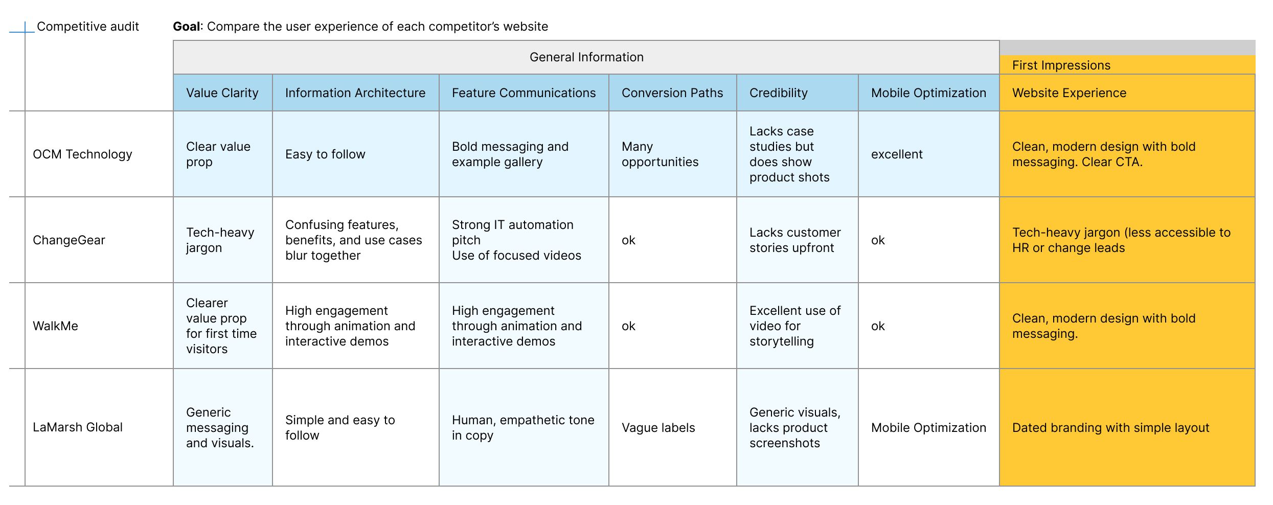
Research Method
Identify 3 successful competitors for competitive analysis.
Key UX Takeaways
Strengthen:
- Visual storytelling: Use product visuals
- Clear CTAs: “See the platform in action” → not “Contact Us”
- Role Based: Address key users (e.g., HR, Change Leads, Consultants)
- Trust elements: Client logos, quantifiable outcomes, use case pages
Avoid:
- Overly abstract language or vague outcomes
- Walls of text—users want skimmable, outcome-driven content
- Hidden CTAs or excessive scroll to understand value
03 | Ideate
User Personas
Based on my research and interviews with stakeholders I created two User Personas to represent our target audience’s motivations, frustrations, needs and goals.
- “Helen the HR Director”
Goals: Find a trusted partner for change initiatives
Needs: Understand services, success metrics, get buy-in from executives
Frustrations: Measuring engagement and adoption - “James the Project Manager”
Goals: See outcomes, avoid disruption, maintain team morale
Needs: High-level overview, credibility indicators, book a conversation fast
Frustrations: Managing multiple change programs

User Flows
Mapped high-priority user flow:
- From homepage → Prop detail → CTA → Reg form
- From homepage → Sign in → SaaS App

04 | Design Process
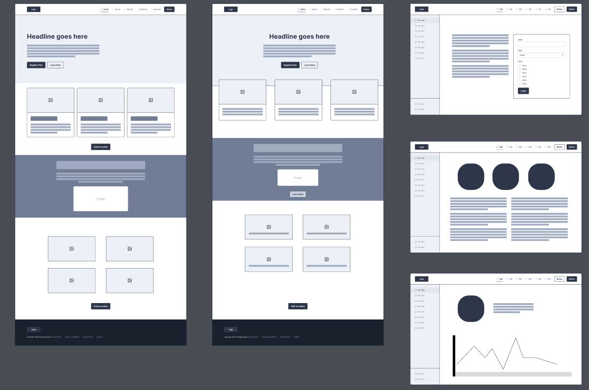
Wireframing
I started with low-fidelity wireframes to get stakeholder alignment on content priority and page structure. I used my combined research findings and persona to guide my design.
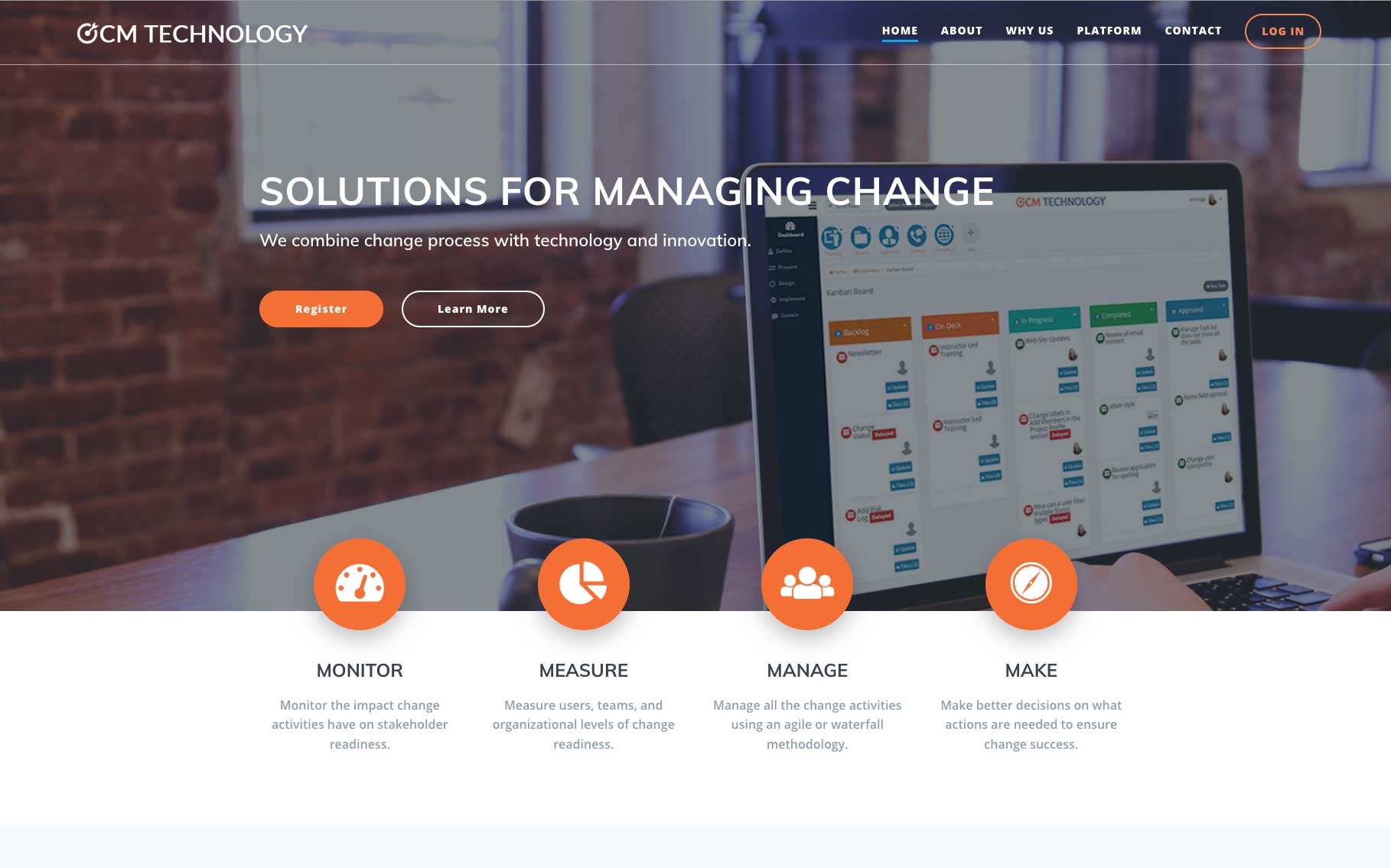
- Hero with value prop + CTA
- Services broken down simply
- Gallery of screen shots
- Sticky nav
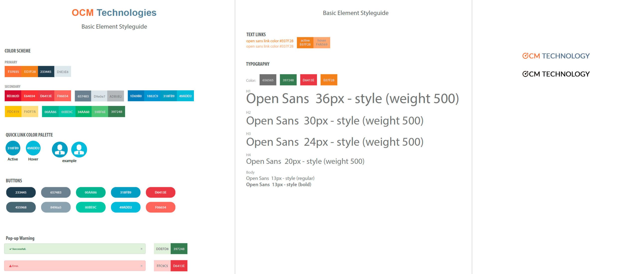
Visual Design & Branding
Working closely with stakeholders I created the visual identity for digital.
- Logo creation
- Website warm neutrals + confident burnt orange
- Clean typography
High Fidelity Design
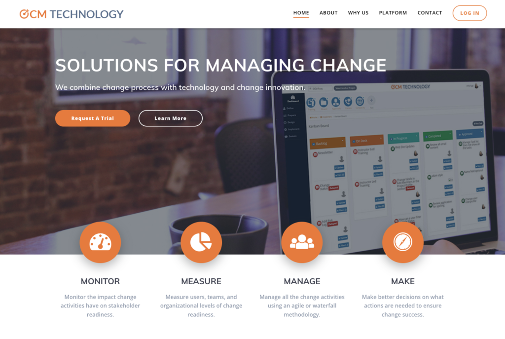
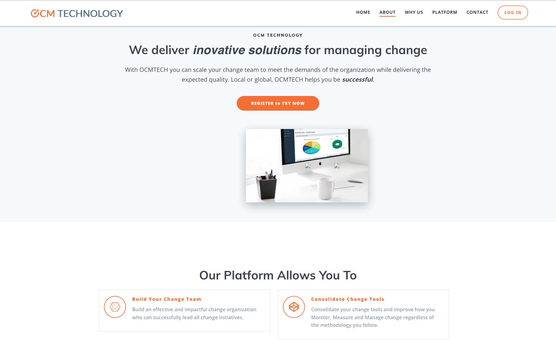
Landing page highlights:
- Sticky nav
- Hero with value prop and CTA
- Gallery (interactive modules)
- Testimonials carousel
- Responsive design from mobile-first
05 | Development Handoff
Developer weekly check-ins
I created detailed specifications in Figma, including:
- Desktop + mobile breakpoints
- Interaction behaviors
- Components library
- Style guide
6 | Launch & Results
Post-launch metrics (30 days)
74%
Trial request up
3:12 min
Avg. time on site
3
Partnership inquiries
18%
Traffic: completed an interaction
Key Learnings
This project was a perfect example of UX being both a translator (complex platform → simple story) and a strategist (designing for conversion, not just aesthetics).
By deeply understanding the client’s product and their journey habits, I built a site that doesn’t just look good—it works smarter.